Plan01 series comparison
Plan01 series comparison
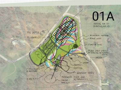
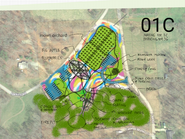
Below is the first 3 designs. Please compare them and consider how they fit your requests, or do not. Your feedback will guide the next phase of the design. Take your time and think about each plan and notice your reactions. You may record your comments below in the comments section on each page (online). Or you may also just print the images out and write your comments on the page and mail them to me. I can also set up a video meeting if you prefer.
These drawings attempt to show 3 substantially different designs. Comparing them helps us to identify problems, likes, dislikes, space issues, etc. It is highly unlikely that my first impression from our conversations is perfect. Also, seeing your ideas on paper (pixels) may spur new ideas or change existing ones.
At this stage, we want to "claim space", try to allocate the big areas to their intended use. Then we can refine and expand on the details in the next steps.
For more details of each plan, click on the highlighted titles. You may click on the images as well to see them larger in your browser.
Features Common to all 3
- 72 seating plus overflow areas
- oval knot garden in front of the chapel with space for seating
Differences
- 28 parking spaces
- the parking is more spread out and uses more space but leaves room for plants in between
- oval paths pattern in orchard
- the area behind the chapel is lawn
 |
| 01A more detail |
- 42 parking spaces
- parking is compact, more utilitarian, less decorative
- area behind the chapel is lawn
 |
| 01B more detail |
- 36 parking spaces
- parking is compact, uses multiple entrances
- area behind the chapel is a wildflower meadow
 |
| 01C more detail |
My comments
- Each plan has overflow parking so maximizing that might not be the most important factor
- Beauty is equally important. One must consider if a poorly placed parking lot spoils the view
- In 01C, the drive encircles the play area under the big tree. Is that best?
.
.
.
.


Comments
Post a Comment